Key Outcomes

37% reduction in manual effort
By consolidating workflows, the team reclaimed the time that was previously lost to manual data entry and cross-referencing.

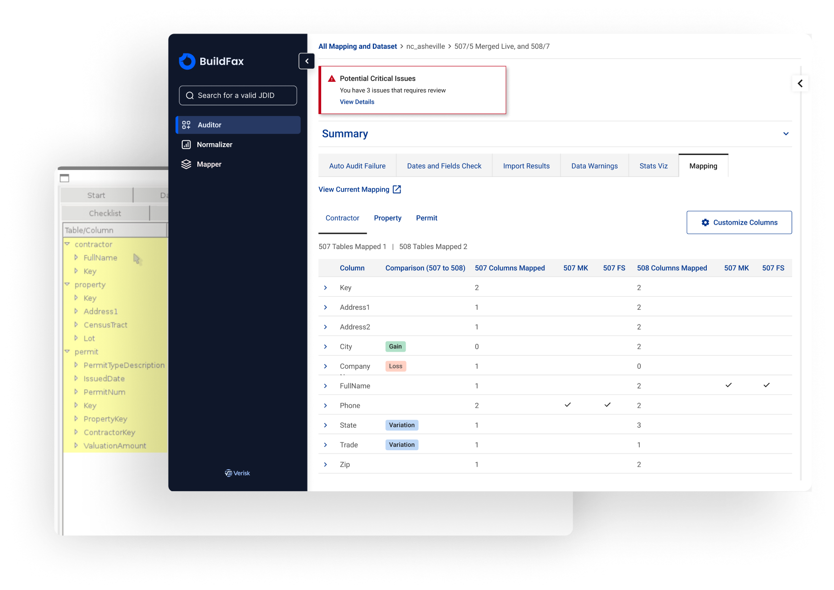
All-in-one system
Successfully retired the reliance on three fragmented tools, creating a single, unified source of truth.

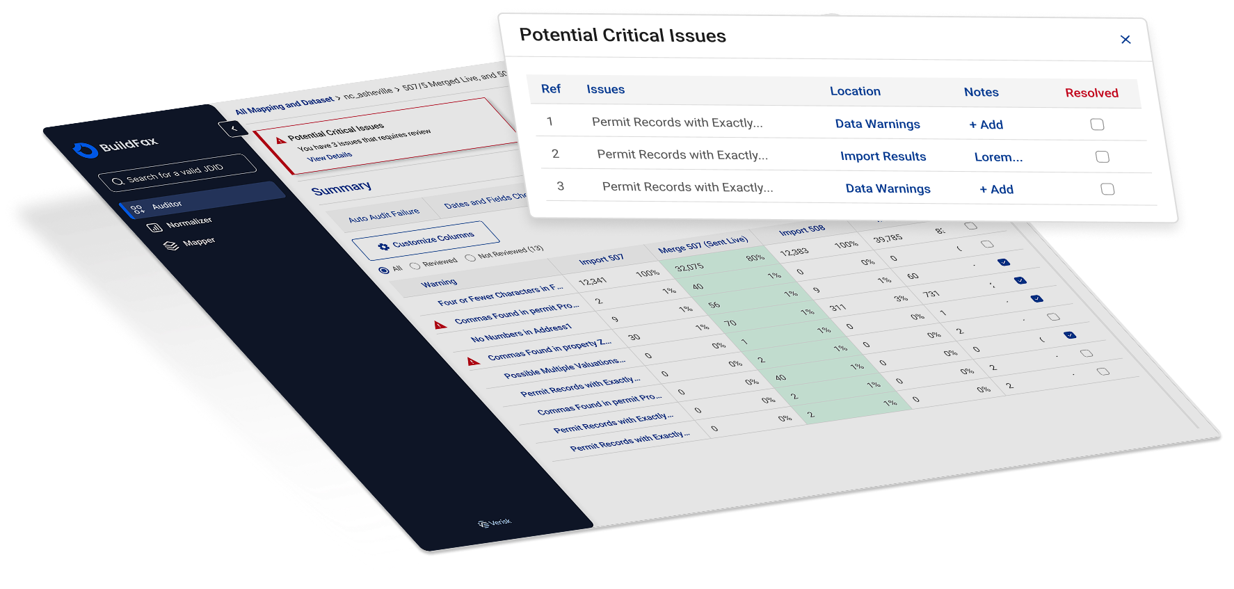
Real-time audit trail
By moving the workflow out of offline spreadsheets, we established a centralized decision history.